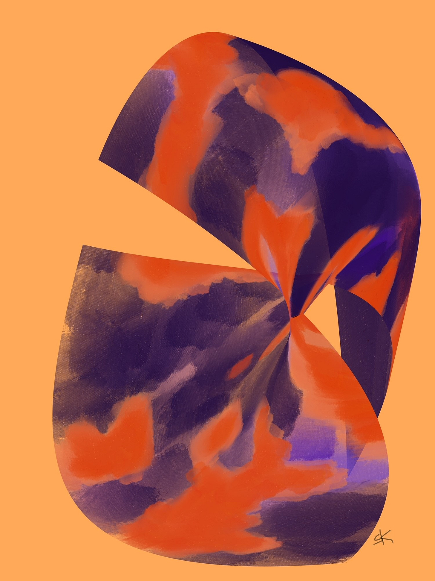
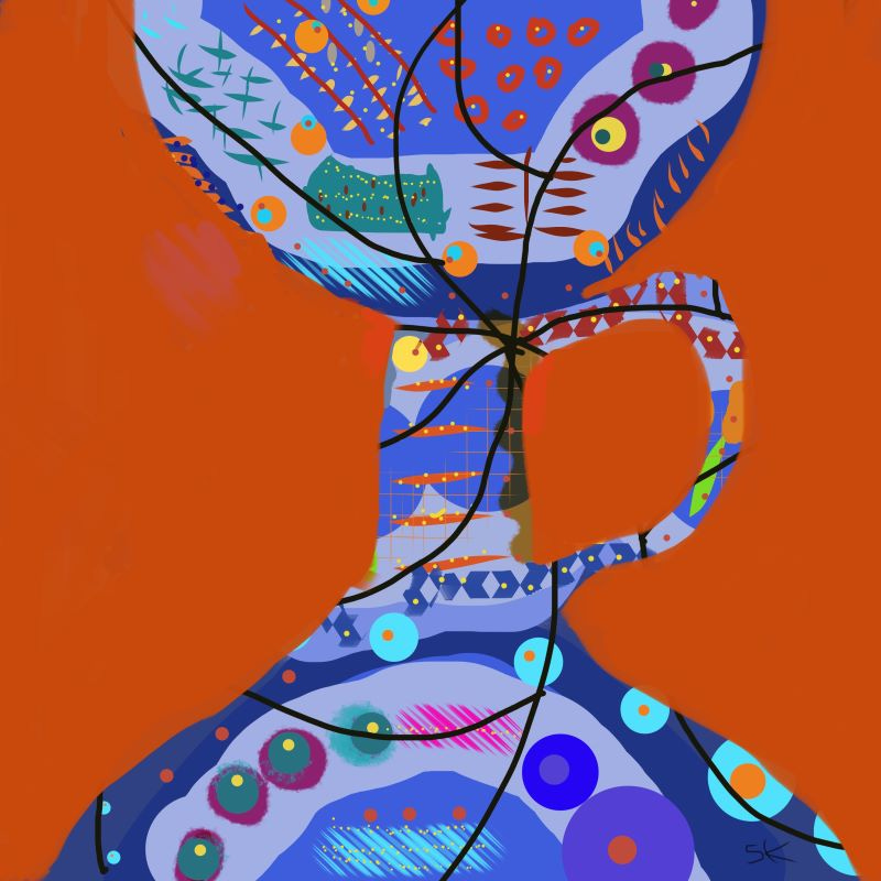
When you look at the image above, what is your first impression? You may notice there’s a lot going on with how the elements (colors, shapes, lines, position, ) relate to each other as a whole. The viewer’s brain picks up on different things that stand out.
For instance, the surrounding pale orange color here is not the subject of the painting; rather, its shape helps define the subject. The dynamic presence of ‘negative space’ in a design provides contrast for the subject and adds balance to a composition. It allows our eyes to move, adjust, and re-interpret what we see.
Wait, what?
I make artworks in spite of limits presented by visual impairments. If you have read my story The Waiting Room you may know that my vision and depth perception are dodgy due to severe damage to one of my eyes. I embrace the paradox! I’m open to diverse ways to explore creativity. Lemonade out of Lemons, I say!
The two years of adjusting to surgeries and bandages, the routine of sleeping only in one position, on only one side, spending every day in dim rooms…all fed my desire to resume the novice art practice I had started after retirement from teaching. I wanted to come out into the light and push colors around again.
The back porch studio was still well supplied. Shelves and drawers were labeled with everything I needed to resume painting.
The table with jars of paints and water was set up and ready. But any attempt I made to get pleasing colors onto a brush, then get the brush to a strategic place on the canvas, proved frustrating and exhausting.
I didn’t have the coordination, perceptual acuity, or stamina to go at it for more than a few disappointing minutes at a time. Then there was the clean up.
So what a thrill to inherit an iPad with its simple native ‘Notes’ app! I was and still am surprisingly pacified for months and years, painting with digital brushes and colors. I recline against bolstering pillows, and prop the miniature computer on the incline formed by my knees. The distance from eye to iPad presents no issues with depth perception. My right eye is squeezed closed behind the prescription glasses I need for my left eye, as I play with colors, shapes, and textures. I have found my happy place!
Like many of us, I had assumed that vision was either see all or see nothing at all. We either recognize objects with confidence and proceed, or grope our way through a World of Darkness and risk crashing into walls or over cliffs with every step.
But it’s not like that.
If even one eye has a cornea swollen and damaged beyond repair, along with a ragged retina, and the lens that shattered into pieces had to be sucked up in a tiny vacuum and discarded….we’ve got a problem.
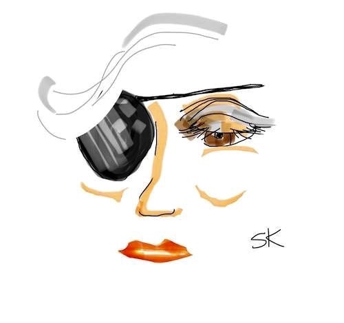
Sure, it’s cool to have a good excuse to accessorize with a pirate patch and a stuffed parrot, but it’s a squawking “Polly Wants an Excedrin!” by evening’s end.
Like many of us, I had assumed vision was either see all or see nothing at all. We either see stuff and proceed, or grope through a World of Darkness and risk crashing into walls or over cliffs.
Ten years later, my brain is still hyper vigilant, daffy from deciphering dueling data signals rushing to the optic nerve from each eye. Wonky input from the right, too much glare, no definition, dark blurry boxes, fuzzy fabrics, false details.
I tend to list to the left when walking down a hallway; I don’t take clearing corners for granted, either.
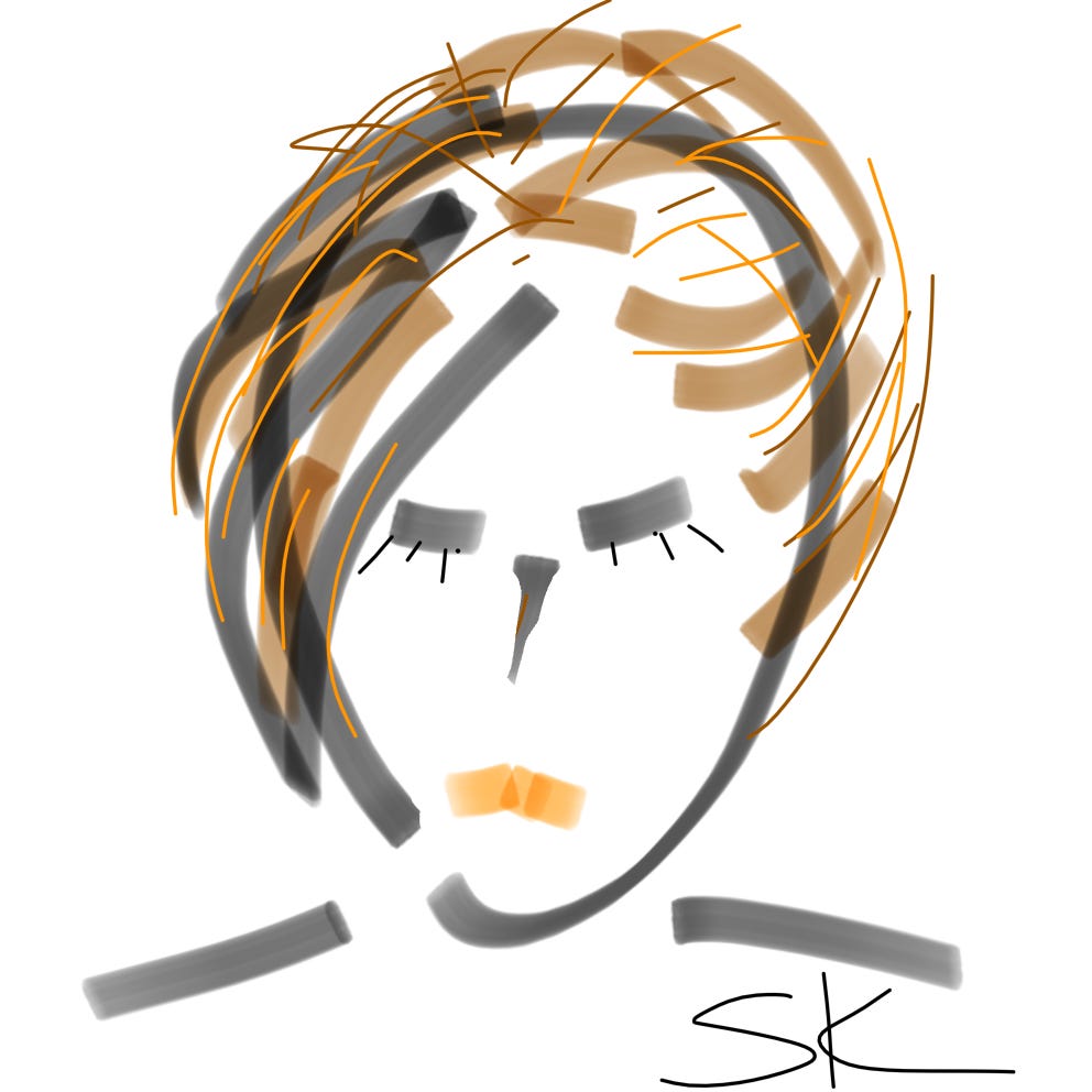
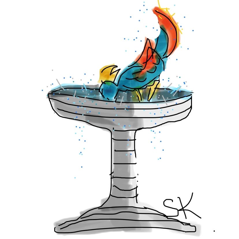
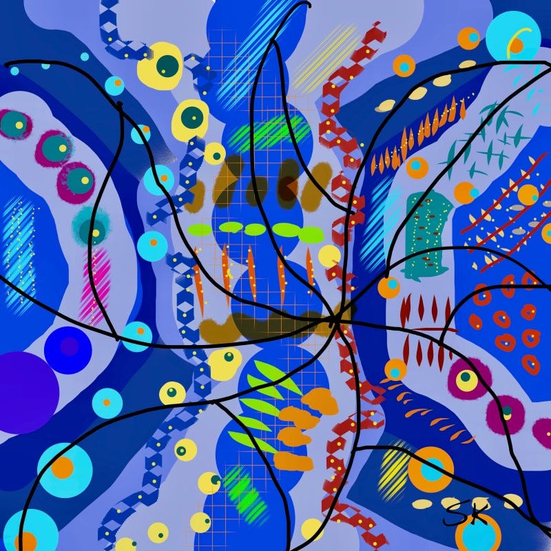
But once I started working with a more elaborate painting app, ‘Procreate’ for iPad, I felt like I was coming alive again. I still don’t know how to use the advanced tools, but I now have a library of hundreds of images that please me. I have had many of them professionally printed in different sizes. Some of them are hanging on the walls of friends and online collectors, and it’s really a hoot to be able to say that.
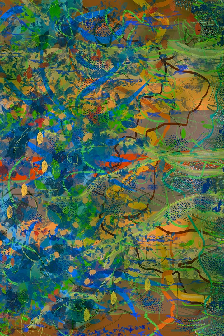
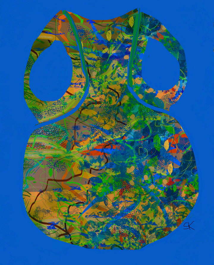
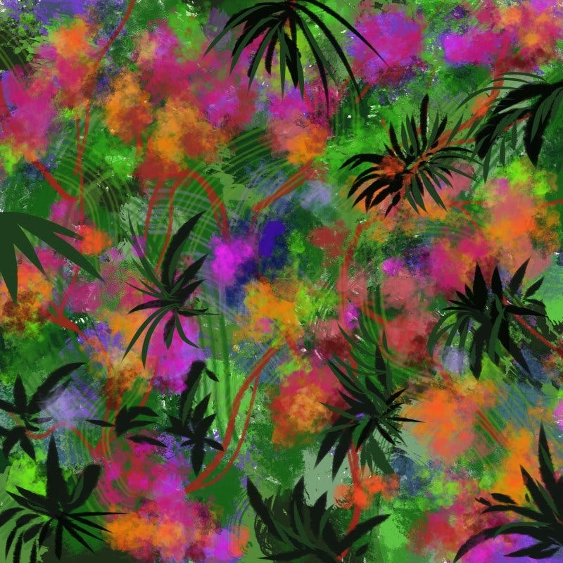
The two artworks above are related to each other, as are the other pairs in this article. I start with an idea that comes from whatever colors and strokes take shape on the screen/canvas. After I finish, I go back and play with adding a background.
I am drawn to the shapes of containers: vases, pots, pitchers, goblets, jugs. I wanted to paint a series of decorative vessels, but didn’t think I could manage a complex pattern or design and stay within the outline.
So I chose from completed artworks, made a copy and downloaded it to a blank screen/canvas in ‘Procreate.’ Then I literally took away any part of the painting that wasn’t the vessel I wanted to see there. I used orange against the blues to surround the invisible goblet-to-be with a contrasting background.
Voila! It worked! Negative space was created to define the vessel.
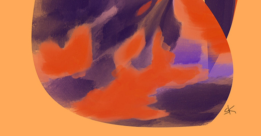
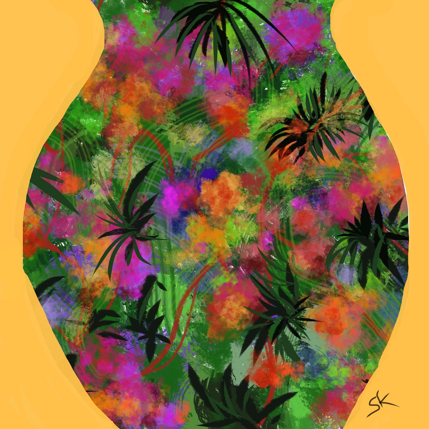
In the pair below, I called the initial painting “Dense Tropical Flair,” with its magenta and gold flowers, spiky green leaves, and swinging vines. It seemed to flow with abundant feminine energy, so I wanted the container to suggest the strong curves of a “Tropical Floral Mama."
Then I literally covered up any part of that painting that wasn’t the vessel I wanted to see there.
Yes, the gold background is the negative space in this one. Thanks for coming along for the tour. I’ll be posting and sending The Weekly Sher, aiming for Wednesdays. I’d love to hear what ways you’ve found to Brighten up the Moment.




Sherry, I am so glad you found me. I love color, pattern, and abstract painting too. I even worked for a time applying color and pattern to 3-D forms I created in clay. I so appreciate how you've turned a disability into an asset in your art. You have a unique way of seeing the world. Your art has powerful feminine energy and is lovely. Wonderful. I love Procreate too! Aren't the layers just so handy. I look forward to reading more of your posts and getting to know you better.
Sherry, I enjoyed this and can see how the negative space enhances the art. Thank you!